Film poster analysis

This poster shows that the movie has got something to do with space which connotes that the genre sci-fi. Thriller may also be a sub-genre as the story-line might have a good build up; keeping the audience curious and hooked on.
 This movie would be mainly suitable for adults over the age of 18 as it involves more mature content and it doesn't involve teenage life or comedy which is it what younger people stereo-typically enjoy watching. It would also be harder for children to understand the plot as it seems like a science fiction film.
As the poster doesn't contain much colour and it is mainly just black, it connotes that it's not a happy, joyful film but more of a thriller and action type of film. They have only used red for the title of the movie so that the name can stand out; and red is known to be the most eye-catching colour.
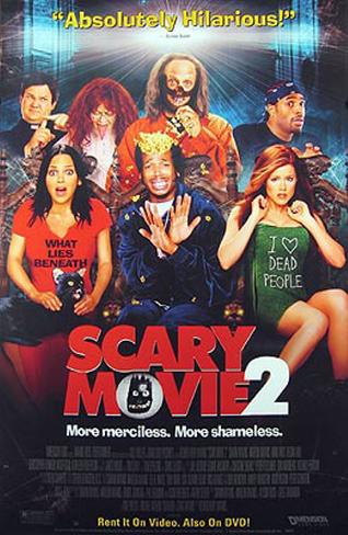
This genre of the movie seems to be a mixture of comedy and horror. The horror side is connoted by the title and the comedy side is connoted by the slogan at the top 'Absolutely Hilarious!'
The movie seems suitable for teenagers as the people shown at the front (the main characters) seem quite young; if other young people are featured in it or if the story-line's based on teenagers, it would attract more young people.
They have also used red for the title of the movie as this is the most eye-catching colour; which means the name of the movie would be the first thing people would look at. They have used a bit of colour in the poster this time which connotes that there will be some comedy in it and the movie isn't completely based on serious things.
.jpg)
'Uzak' looks like a film mainly based on one person and it could be a story about his life; this means that the genre is most likely drama and the story-line would also sound less fictional as it is based on someones life.
They haven't used a wide range of colours and kept it quite dull and simple. This shows that this film is suitable for mature audience because if they were trying to attract children, they would've used a lot of colour.
The man standing on his own also represents loneliness and it makes audience wonder what has happened to him which would make them want to watch the movie. They don't give much away from the poster which makes it seem more mysterious and builds up curiosity for the audience.

This film is based on a young boy so you can automatically tell that their main target audience would be children and teenagers.
The movie seems to be a mixture of mystery and thriller. The boy is looking into a dug in hole which could even connote an element of horror; dug into a graveyard.
It is a low-angle shot which makes the boy look superior and it connotes dominance and power; role of the main character.

This movie would either be a 15 or an 18 age rating because it clearly contains violence which is not suitable for children. The story would also not be so appealing to most children as it is not what they typically enjoy watching.
 Once again, in this shot the guy in the middle is pointing his gun downwards which shows whoever he's targeting at his lower than him and more inferior.
This poster has certain conventions that show it is fictional; this means that genre could be fantasy.
The poster and the name of the movie denotes that it is about pirates. This means that the movie is mainly aimed at the younger generation as the story-line would be more suitable for their age group as they'd enjoy it more. It would also be a family friendly film as kids can watch it; adults with young children would also be a target audience as they would be the ones taking them to the cinema.
They have used a medium shot for the characters faces which is quite a common angle and it doesn't connote much as it is a neutral shot.

Bride&Prejudice seems like a romance and comedy film. From the poster I can also tell they are challenging stereotypes as it is a White man with an Asian woman.
This film would be suitable for 15 and over as the story-line wouldn't be that appealing to children. The film would also attract a lot of Asian audience as you don't have many British institutions producing films about Asians being the main character.
As soon as you look at the poster you can tell the movie is targeted at mature audience and it is more of a serious film. They have used minimal colour and mainly only used black which connotes that the film isn't about laughter and comedy. The dark colours also connote the seriousness.
The main genre would be sport and drama could be a sub-genre. Feminism could also be another element of the movie as the woman is put right at the front of the poster which connotes that she is the most important character and it also shows a sense of superiority. The woman is the athlete in the poster and stereo typically it is usually the men that are strong and powerful; they are challenging stereotypes.
No comments:
Post a Comment