Tuesday, 16 October 2018


In this video I have merged 3 different clips. All clips have non-diagetic sound as they are sound effects or music that have been added on afterwards. In the beginning, for the first few seconds we used the sound that was originally in the movie scene which is parallel sound and then for the rest of the video we used contrapuntal sound as it didn't have any correlation to what was happening in the scene.

Wednesday, 10 October 2018

Mise-en-Scene makeover: Learner Response

1. 

WWW:

- Good lighting; warm tone
- Profile shot 
- Very good makeup 
- Still images; final reveal 

EBI:

- Embed video on blog 
- Include music (use media technician or other student)
- Fix camera focus
- Too long; follow instructions

2.

WWW:

  • The makeup is very well done
  • Silence is perfect 
  • Makeup was good 
  • Excellent use of lighting
  • Lighting and it was very clear
  • Good editing 
  • Close up at the end

EBI:

  • Add music to the video 
  • Length of the video
  • Transition


3. 

WWW:
In my video my lighting was good as the room was well lit and it hard a warm tone which suits the angel side specifically. Used a profile shot so you could focus on one side of the makeup and see what was done clearly. The makeup was very good. The final reveal was good as you could see the makeup and final result properly. 

EBI:
Embed the video on the blog properly. Include music in the video so that it is not plain and audience don't get bored. Fix the camera focus as it goes out of focus at times. Video was too long, fasten up the time-lapse so that it is within two minutes long. 


4. 

This look was inspired by an image my friend found on Pinterest of a girl doing a half angel and half devil makeup look. I added on some of my own changes to the look to make it more unique. 


5.

I need to add sound/music to the video. Include texts; mainly in the beginning and the end. Include more transitions


6. 

Lighting makes a big impact on videos. You need to have clear, bright lighting whiles doing transformation videos. Costume could also make an impact on the video, I chose to wear a plain black top so that it is neutral for both looks. Makeup was the main focus in this video as it is a transformation video; the makeup was what added onto the effects and showed the audience what the whole look was about. 


Film Noir Research


This is a thriller short film. It is a fast paced video which has scenes and dialogue changing rapidly. The scenes were changing quick which could also link to the actor looking at the time constantly during the video. In the beginning, they used high-key lighting to show all the antagonists faces and then made the protagonists face darker using low-key lighting and creating a shadow effect to create suspense and increase curiosity. Not revealing the main characters face in the beginning links to the title of the film 'Stranger'. 

There is the same music being played throughout the video and then starts getting more intense during the climax as the tension builds up and then it goes back down to the more relaxed music. The music in the beginning is relaxed but also builds up mystery as it doesn't give away anything about what is going to happen. The voice-over in the back is effective as we know what the persona is thinking. 

The lighting gets brighter using under lighting and the protagonists face is revealed as we get more into the short film. Taking time to show the actors face can build up tension and keep the audience intrigued to see who he is and what is going to happen. 

There is a plot twist in the climax which is caused by a disruption, it went from a calm pub scene with the protagonist talking about his beliefs and just as something good is going to happen to him, a villain walks in with a gun.


Lighting: still image analysis


In this image they have used low-key lighting. There is back lighting which is what gives the light effect on the characters face. There is also top lighting which helps add onto to the smokey effect.

The use of low-key lighting in this image makes the female look like a villain. The dark background connotes that she is a dark character; villain. The shadow effect creates mystery for the audiences' and connotes that this is a mystery/thriller film.


In this image they have used low-key lighting. They have also used top lighting which creates the shadow effect on the characters face, this creates mystery and and the way she is looking up at something/someone connotes she is the inferior character as she is below the other person or object. Both her hands being on her face could also connote fear.
The shot is taken from a lower angle so that you can see the shadow effect on her face. Everything else is blacked out apart from her face which builds up curiosity and makes audience wonder where she is and what she is doing.


This image has high-key lighting as it is set outside during the day time. You can see the characters face clearly and the bright lighting on his face shows power and goodness. The setting being outside with natural sunlight shows realism.

It is a medium shot which shows the audience the protagonist but doesn't give away too much about the setting and his surroundings.


In this image they have used low-key lighting along with a dark costume for the character. They have mainly used back lighting and top lighting in order to put the focus on the main character.

The camera angle and the use of lighting on the characters face males him look powerful and tells audience that he plays an important role.


They have used high-key lighting here as you can see the actors face properly.
Although they have used high-key lighting, they have also still created a shadow effect which creates a dramatic effect adds onto the audience curiosity. 


In this image they have used low-key lighting, the darkness creates a private, closed up feel. The side lighting reflects the shutters on the actors face; shows it is during day time.
The back lighting shows there are other things happening in the surroundings.
They have included some warm colours in this scene which conveys the element of love and romance.


They have used low-key lighting in this image which creates the long shadows at the front.
The shadows at the front are caused because of the back lighting.


This image has low-key lighting, there is a shadow effect being created on the actors face and on the wall which portrays the enigma.
They have used a close-up so that audiences' can see the characters facial expressions close up.


They have used high-key lighting in this image as there are no shadows. This is a low angle shot which makes gives the person more importance and portrays them as a powerful person.


This image has low-key lighting. They have not used much lighting which may be to signify the horror or thriller element of the movie/show. Dark lighting connotes mystery, horror and the aim is to make the scene more dramatic.

There is back lighting and side lighting in this image, these lights help the audience see the character in the shot but everything else is too dark to be seen which builds up questions in the audience head.


They have used high-key lighting in this image as you can see both the actors faces. They have mainly used under lighting and filler lighting which is what creates the shadow effect in the back.

This medium shot enables audience to see the actors faces and their facial expressions along with some of the surroundings; e.g. the gun in the man's hand.


Thursday, 4 October 2018

Media Transformation


My transformation is into an angel and devil. I decided to do this as Halloween's approaching. To do this look I done makeup using gold and neutral colours on one side and then red and dark colours on the other side; I also made my face look more pale to represent the inhumane side. 
I wore a black top as it would be neutral for both sides and just left my hair out; straight as it suits both looks. I used bright lighting so that you could see exactly what I was doing and didn't create any shadow effects on my face as it is a transformation video and the audience need to see my face clearly.

Tuesday, 25 September 2018

Mise-en-scene

Distinctive still image:

Image result for distinctive still image of people

From this image you can tell that it is a family or friends casual day out/gathering without seeing any movement or physically being told. There are different mise-en-scene's that tell the audience this. We can tell it is a positive atmosphere because of the bright lighting and it also seems to be a sunny day. The people in the image are also dressed casually which connotes that this is a normal day out, it also adds on to the weather aspect as the women wearing dresses represents summer. They are also not wearing over excessive makeup which shows that it's not anything special or dramatic. 
The people are holding cups and have food on their lap; these props could be to connote that it is tea time. The setting us quite unique as the building looks quite old, it could be the outside of a vintage cafe. 


TV extracts:


All three of these movie trailers have elements of mise-en-scene that make them show the audience what their main genre is without having to be physically told. 

In the first trailer they have used a normal setting and a happy atmosphere so that it is lively and the audience feel the joyfulness. The setting, props and costumes used are casual things that everyone would be familiar with; audience would be able to relate back and this way they would enjoy the movie more. They have used a comedian as the main character which already tells the audience that it's going to be a comedy film. 

In the second trailer they have used lighting to convey the horror side, they had dark lighting at times which generally connotes a dull atmosphere or gives a horror/ghost feeling to audience. In the beginning the camera moves from light to dark (top to bottom) which could be to represent the dead persons life; from living a bright life to now getting buried into the darkness. They have used makeup to show things such as blood which represents the horror aspect.

In the third trailer the lighting is quite cold throughout with some darker scenes which creates mystery and makes the audience question what's happening. The props they have used also help add on to the mystery; for example, when one of the main characters shoplifts frozen food. They also show how the characters change their costume and use makeup to change their faces for different scenarios which builds up curiosity for the audience as they want to know what's happening and why they're doing this.


Wednesday, 19 September 2018


Film poster analysis

Image result for blade runner poster
This poster shows that the movie has got something to do with space which connotes that the genre sci-fiThriller may also be a sub-genre as the story-line might have a good build up; keeping the audience curious and hooked on.  
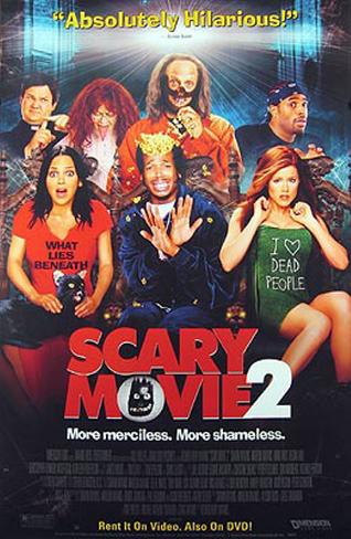
Image result for scary movie 2 posterThis movie would be mainly suitable for adults over the age of 18 as it involves more mature content and it doesn't involve teenage life or comedy which is it what younger people stereo-typically enjoy watching. It would also be harder for children to understand the plot as it seems like a science fiction film.

As the poster doesn't contain much colour and it is mainly just black, it connotes that it's not a happy, joyful film but more of a thriller and action type of film. They have only used red for the title of the movie so that the name can stand out; and red is known to be the most eye-catching colour.


This genre of the movie seems to be a mixture of comedy and horror. The horror side is connoted by the title and the comedy side is connoted by the slogan at the top 'Absolutely Hilarious!' 

The movie seems suitable for teenagers as the people shown at the front (the main characters) seem quite young; if other young people are featured in it or if the story-line's based on teenagers, it would attract more young people.


They have also used red for the title of the movie as this is the most eye-catching colour; which means the name of the movie would be the first thing people would look at. They have used a bit of colour in the poster this time which connotes that there will be some comedy in it and the movie isn't completely based on serious things.


Image result for uzak movie poster

'Uzak' looks like a film mainly based on one person and it could be a story about his life; this means that the genre is most likely drama and the story-line would also sound less fictional as it is based on someones life.

They haven't used a wide range of colours and kept it quite dull and simple. This shows that this film is suitable for mature audience because if they were trying to attract children, they would've used a lot of colour.

The man standing on his own also represents loneliness and it makes audience wonder what has happened to him which would make them want to watch the movie. They don't give much away from the poster which makes it seem more mysterious and builds up curiosity for the audience.

Image result for im not scared poster
This film is based on a young boy so you can automatically tell that their main target audience would be children and teenagers.

The movie seems to be a mixture of mystery and thriller. The boy is looking into a dug in hole which could even connote an element of horror; dug into a graveyard.

It is a low-angle shot which makes the boy look superior and it connotes dominance and power; role of the main character.


Image result for sin city poster

The name of the movie 'Sin City' connotes that it is about a corrupted city which most likely involves crime and action. The characters in the image are holding weapons which also connotes action.

This movie would either be a 15 or an 18 age rating because it clearly contains violence which is not suitable for children. The story would also not be so appealing to most children as it is not what they typically enjoy watching.

Image result for pirates of the caribbean posterOnce again, in this shot the guy in the middle is pointing his gun downwards which shows whoever he's targeting at his lower than him and more inferior


This poster has certain conventions that show it is fictional; this means that genre could be fantasy
The poster and the name of the movie denotes that it is about pirates. This means that the movie is mainly aimed at the younger generation as the story-line would be more suitable for their age group as they'd enjoy it more. It would also be a family friendly film as kids can watch it; adults with young children would also be a target audience as they would be the ones taking them to the cinema.

They have used a medium shot for the characters faces which is quite a common angle and it doesn't connote much as it is a neutral shot.


Image result for bride & prejudice poster
Bride&Prejudice seems like a romance and comedy film. From the poster I can also tell they are challenging stereotypes as it is a White man with an Asian woman.

This film would be suitable for 15 and over as the story-line wouldn't be that appealing to children. The film would also attract a lot of Asian audience as you don't have many British institutions producing films about Asians being the main character.


Image result for million dollar baby poster
As soon as you look at the poster you can tell the movie is targeted at mature audience and it is more of a serious film. They have used minimal colour and mainly only used black which connotes that the film isn't about laughter and comedy. The dark colours also connote the seriousness.

The main genre would be sport and drama could be a sub-genre. Feminism could also be another element of the movie as the woman is put right at the front of the poster which connotes that she is the most important character and it also shows a sense of superiority. The woman is the athlete in the poster and stereo typically it is usually the men that are strong and powerful; they are challenging stereotypes.